Featured site in thumbnail: Pastel Lab
The website design landscape is consistently evolving and keeping up with the latest design trends is more beneficial to your brand than ever. Ensuring your website stands out is the key to converting visitors into customers, whether you’re refreshing your current site or starting a new site from scratch, these 2025 trends are crucial.
Trend 1: Desktop First
Remember when everything was about mobile-first design? Not anymore, desktop view is making a comeback. Designers are finally giving desktop view the mainstage, meaning that there is more room to play with by using wider layouts.
You can even get fancy with navigation, like using mega menus, sidebars or adding icons, without worrying about squishing everything into a tiny screen. But don’t completely ditch mobile, your site still needs to work smoothly on phones. Balance is key.
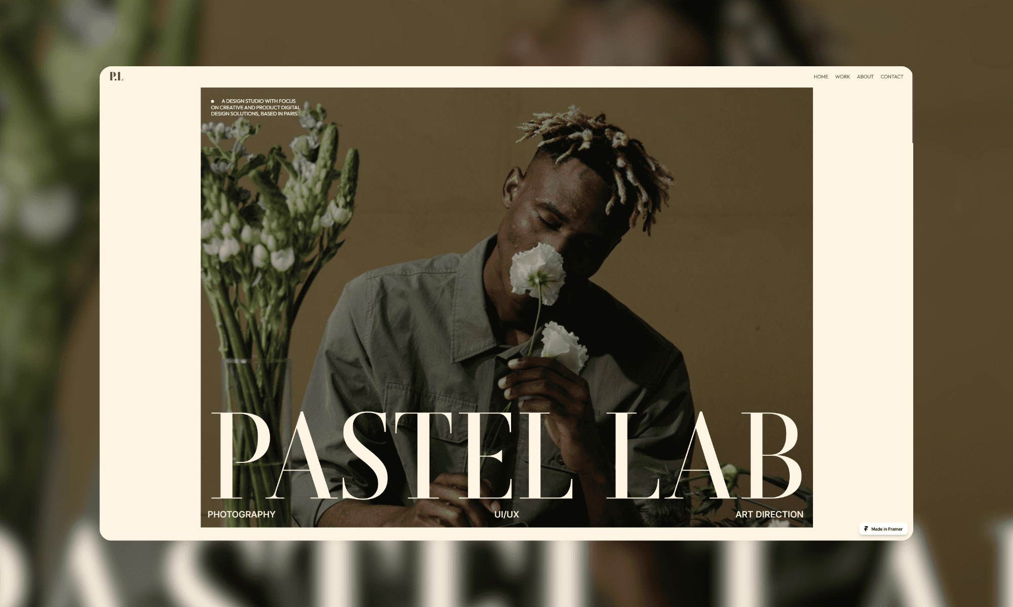
Trend 2: Large Text – Make a Statement
Big, bold text is taking over. Oversized fonts grab attention, make your message clear, and increase visual appeal.
Want to stand out? Utilise large typography for the focal point of your homepage or for the bigger sections of your site. But keep it readable, pair it with ample white space so the page doesn’t look cluttered. Also, pick a font that matches your brands personality. Sleek? Modern? Fun? The choice is yours.
Trend 3: Bento Box Designs
Bento boxes may not exactly be new to 2025, but they still deserve the limelight. This website design trend is about splitting your page into neat, grid-like sections that are easy to read and satisfying to look at.
It’s perfect for showing off lots of content without overwhelming people. You can customise the sizes, play with the colours, and tweak the spacing to make it fit your brand and your websites page. Plus, bento box layouts guide users’ eyes naturally, so navigating your site feels effortless. They are especially useful for laying out the benefits of your product or service.
Trend 4: Movement
People don’t want to scroll through a boring, static site anymore. Movement is where it’s at. Adding animations, videos, or small interactions makes your website feel alive and keeps people engaged.
Adding buttons that have a hover effect or adding appear animations for main sections of content largely increase the enjoyment of using your site. For larger chunks of content, you can also use videos or scroll animations to tell your story or show off your products. Just ensure that they don’t slow your site down - people will soon leave your site if the loading times are too long.
Warning: Overdoing animations can lower the usability of your website and overwhelm the user, so use movement where you see fit.
Trend 5: Hand-Drawn elements
Hand-drawn elements on websites are becoming more popular by the day. They’re add both a fun and unique touch while making your site feel more human.
Custom sketches, if they fit within your branding, can give your site a one-of-a-kind feel. Want to take it even further? Make the elements interactive - incorporating trend 4 into these drawn elements only add to the effect.
Mix the drawn aspects with clean design elements for the perfect blend of playful and professional.
Conclusion
Just like every year website design in 2025 is all about standing out and being memorable. From bold typefaces to hand-drawn elements, we hope that the above trends can give you some inspiration to make your site fun, creative, and unique.
Want to level up your website but not sure where to start? Let’s make it happen with a site consultation!
Frequently Asked Questions
How do I know which web design trend is right for my brand?
Start by considering your audience and brands personality. If your brand is playful and creative, trends like hand-drawn doodles or bold neon colours might fit perfectly. For a more professional or content-heavy site, try bento box layouts or large typography to keep things organised and impactful. Experiment, but always keep your users’ experience in mind.
Will focusing on desktop-first design hurt my mobile site’s usability?
Not at all - if you maintain a responsive design approach. While desktop first prioritises larger screens, it’s essential to ensure your mobile experience is still smooth and user-friendly. Think of it as tailoring your site to excel on both platforms, with an emphasis on maximising desktop potential. If you need more help with mobile design, you can see our guide ‘The Key to Effective Mobile Design: 5 Must Know Tips’.
Aren’t animations and videos bad for loading times?
They can be if not done correctly. The key is to use lightweight animations and optimise videos to prevent slow load times. Tools like lazy loading, compression, and choosing simple small animations can keep your site dynamic without frustrating users with delays. If your website is made within Framer, you can use eye catching animations at no performance cost. See how to get a website made in Framer here.